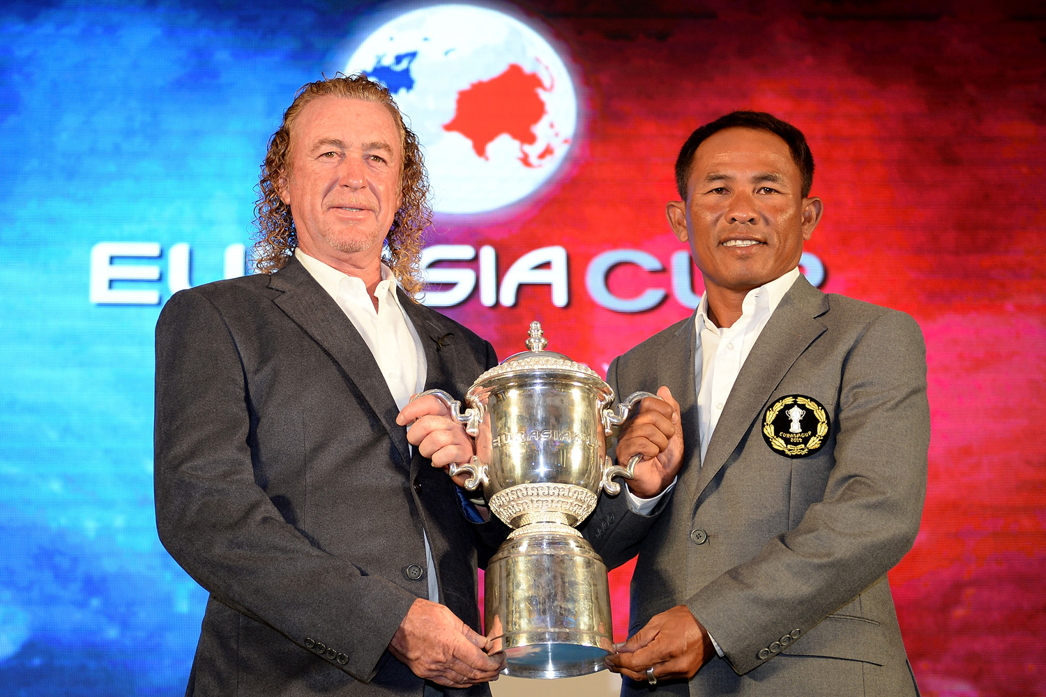
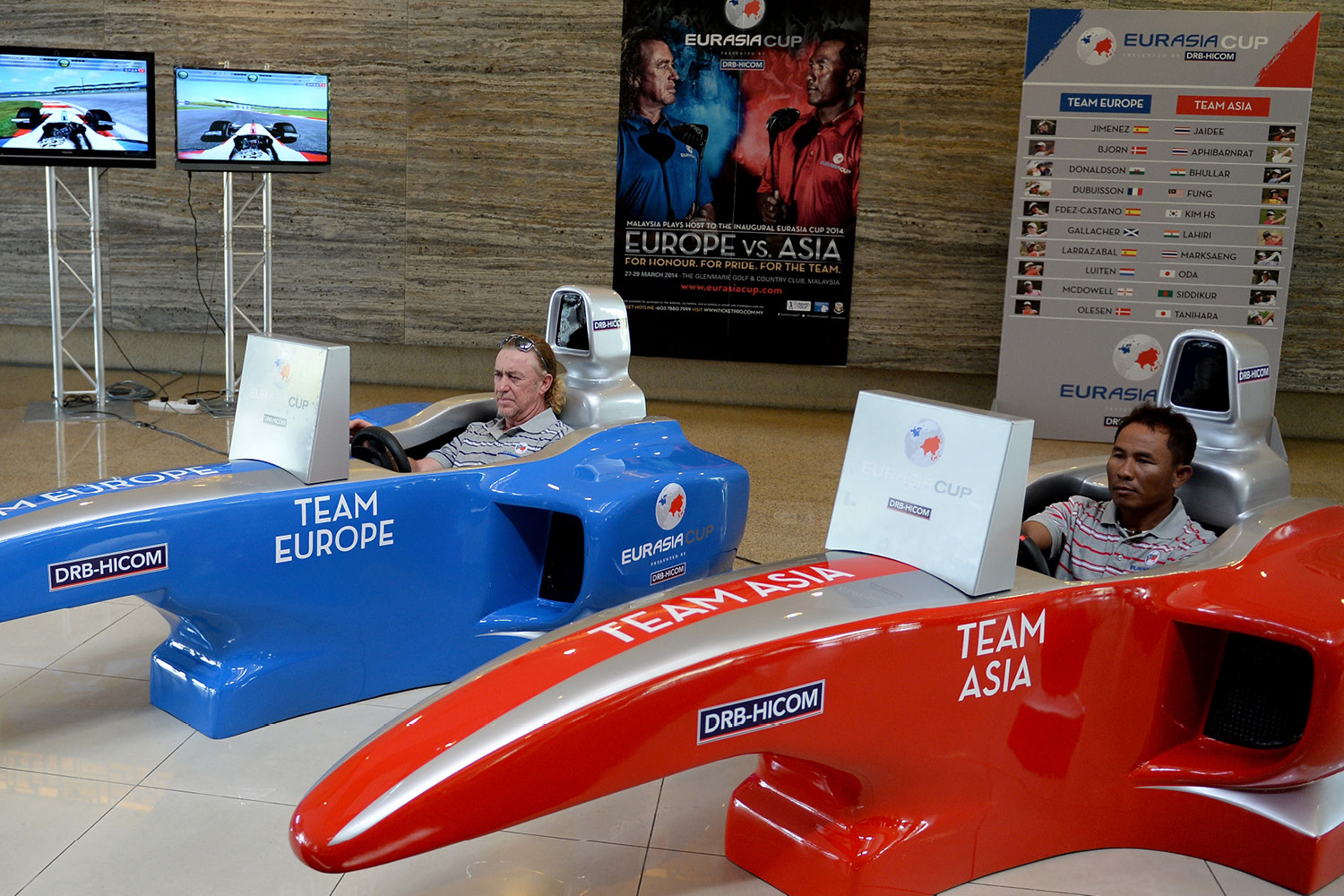
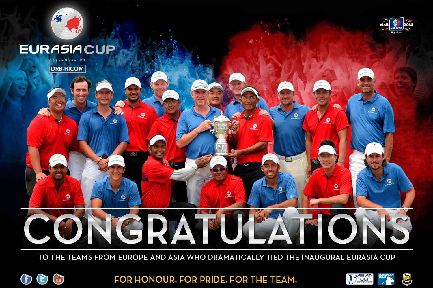
A unique collaboration between The European Tour and Asian Tour to create a major sporting event of global significance – The EurAsia Cup presented by DRB-Hicom brings together golf’s greatest players with a shared goal, akin to The President’s Cup.
The brand proposition, identity and combination of visual elements communicate the values of both brands, and their commitment to the EurAsia Cup. This provides the perfect international brand building and communication platform for DRB-Hicom.
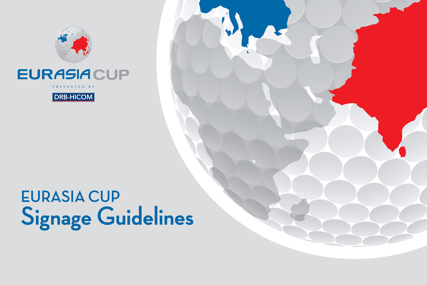
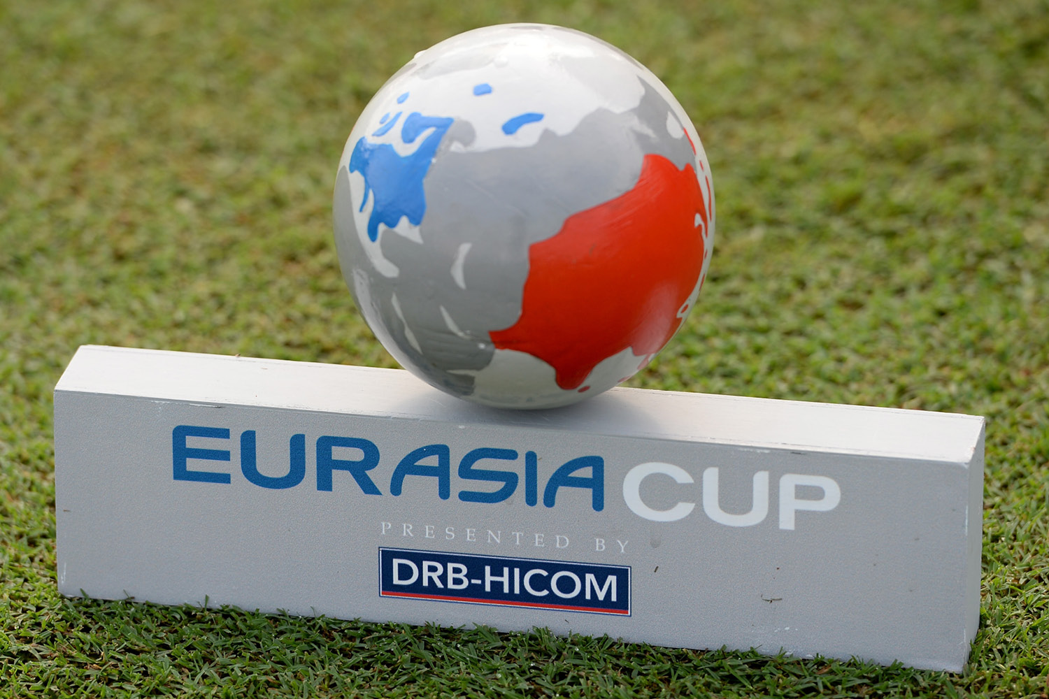
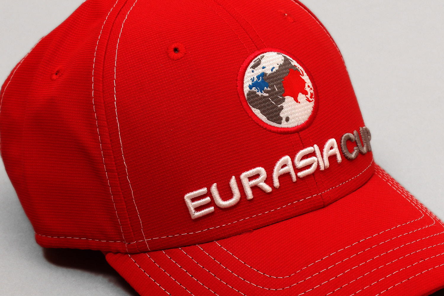
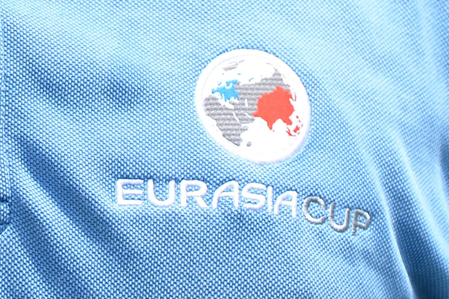
A stylised golf globe was developed to portray the vast scale of this unique partnership, coupled with The European Tour’s hand drawn font. The blue tones within the colour palette express Europe’s unity and identity; the red tones evoke the Pan-Asian passion for excellence and are associated with luck. The modern execution symbolises new horizons, complementing DRB-Hicom’s drive, philosophy and commitment to a dynamic vision.
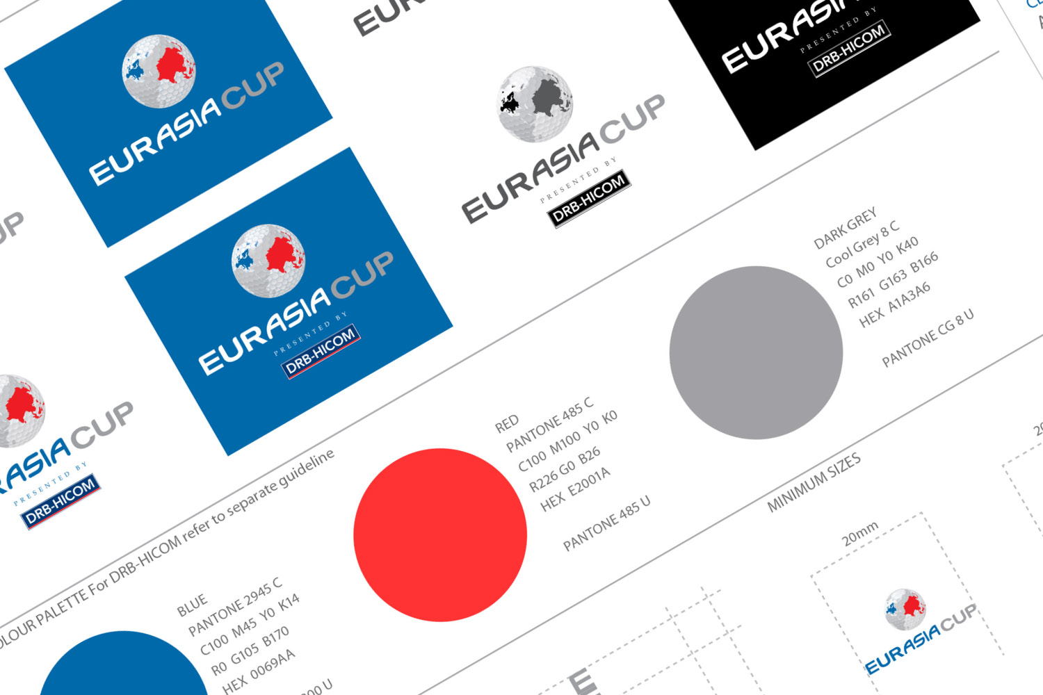
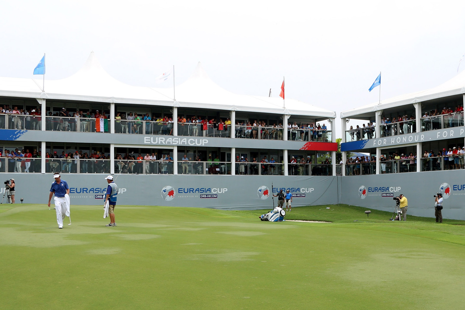
In order to enable consistent on-brand application, we created a brand usage and graphic style guide, detailing a design language for the brand. Through colour, layout, typography and graphic styling a set of assets were created to complement the brand. Red and blue were used to flank layouts, with a neutral grey to unite the two, representing the two teams. With the focus on a centralised logo, the concept is conveyed of the prize firmly centre stage.