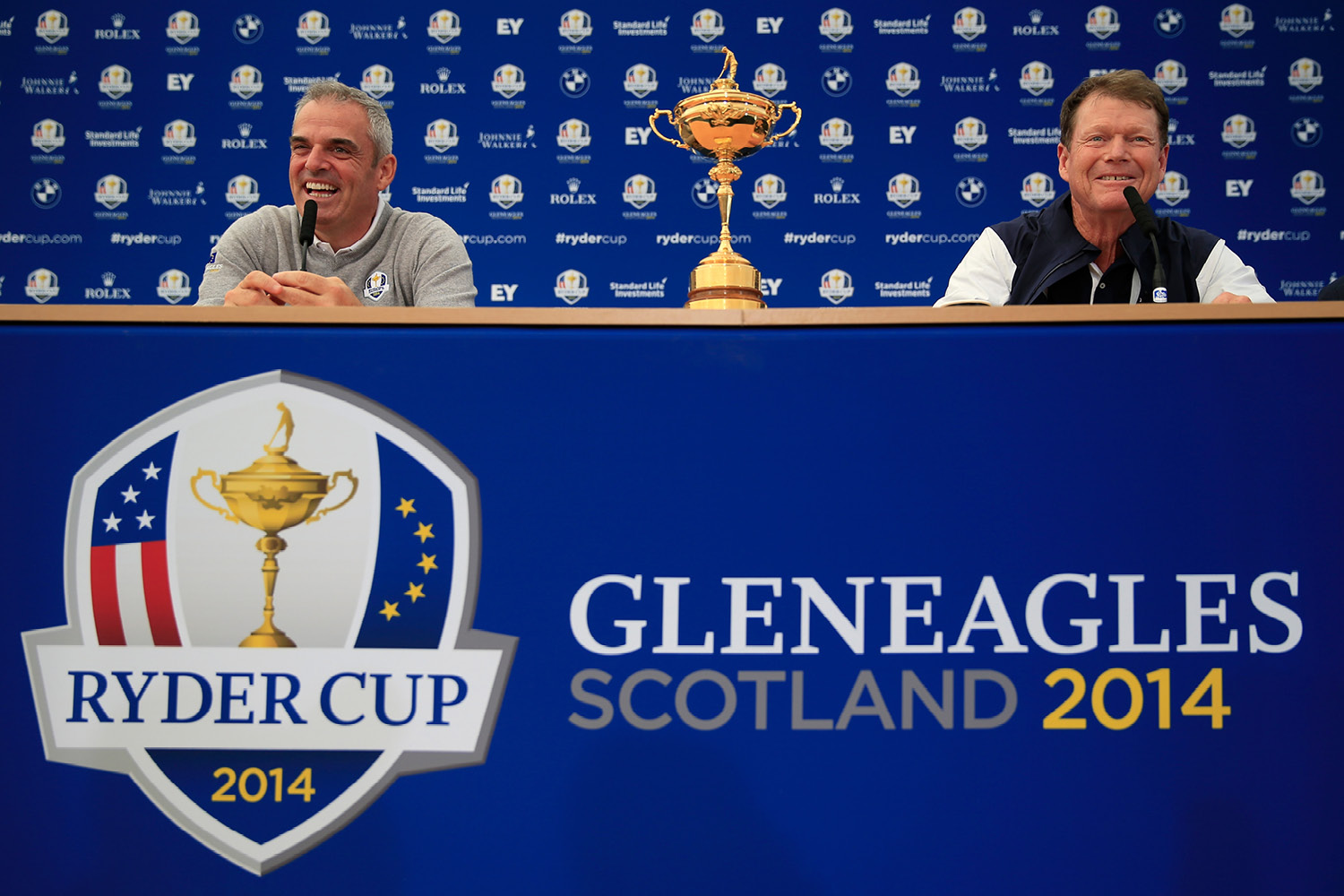
THE RYDER CUP
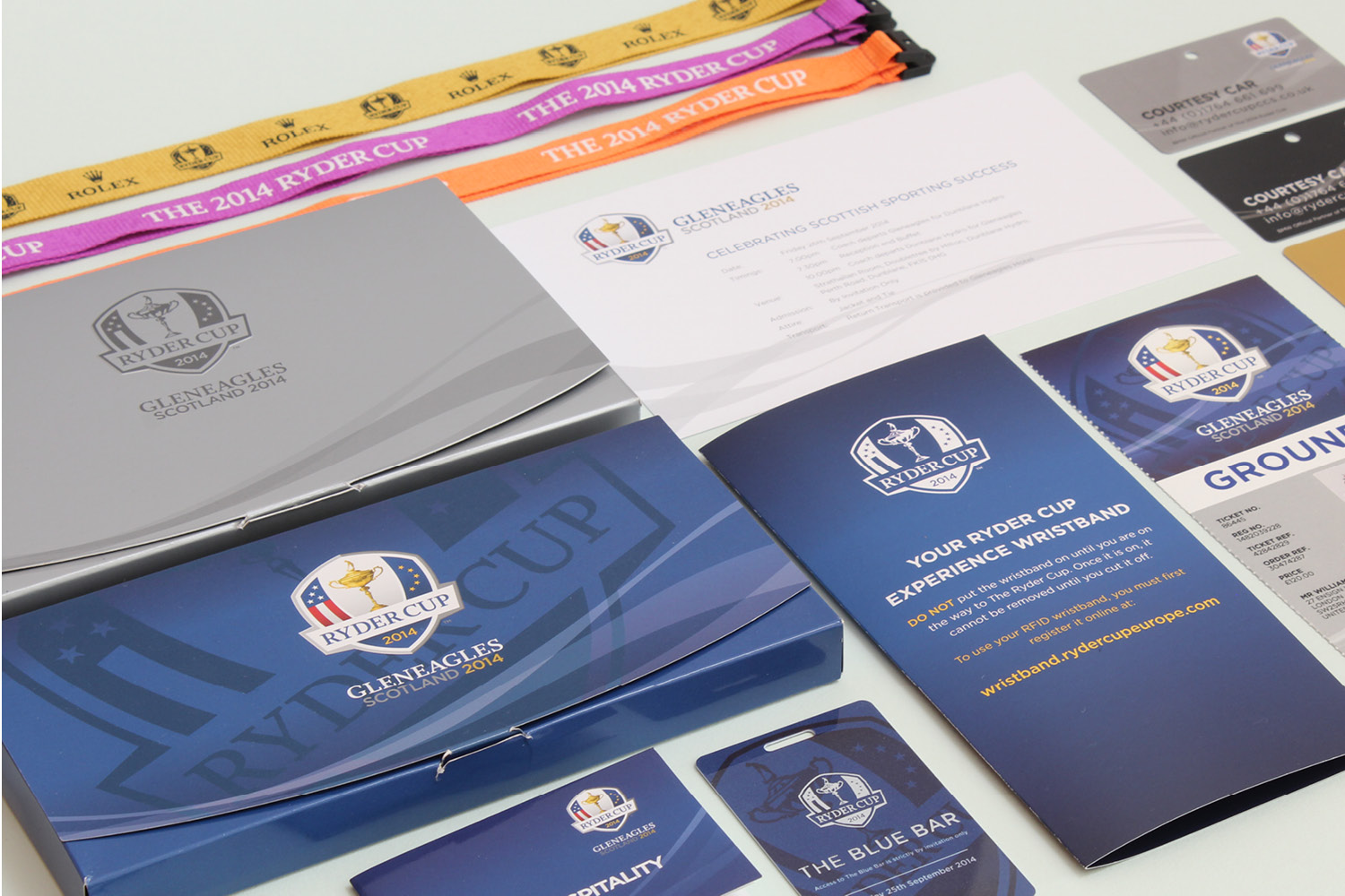
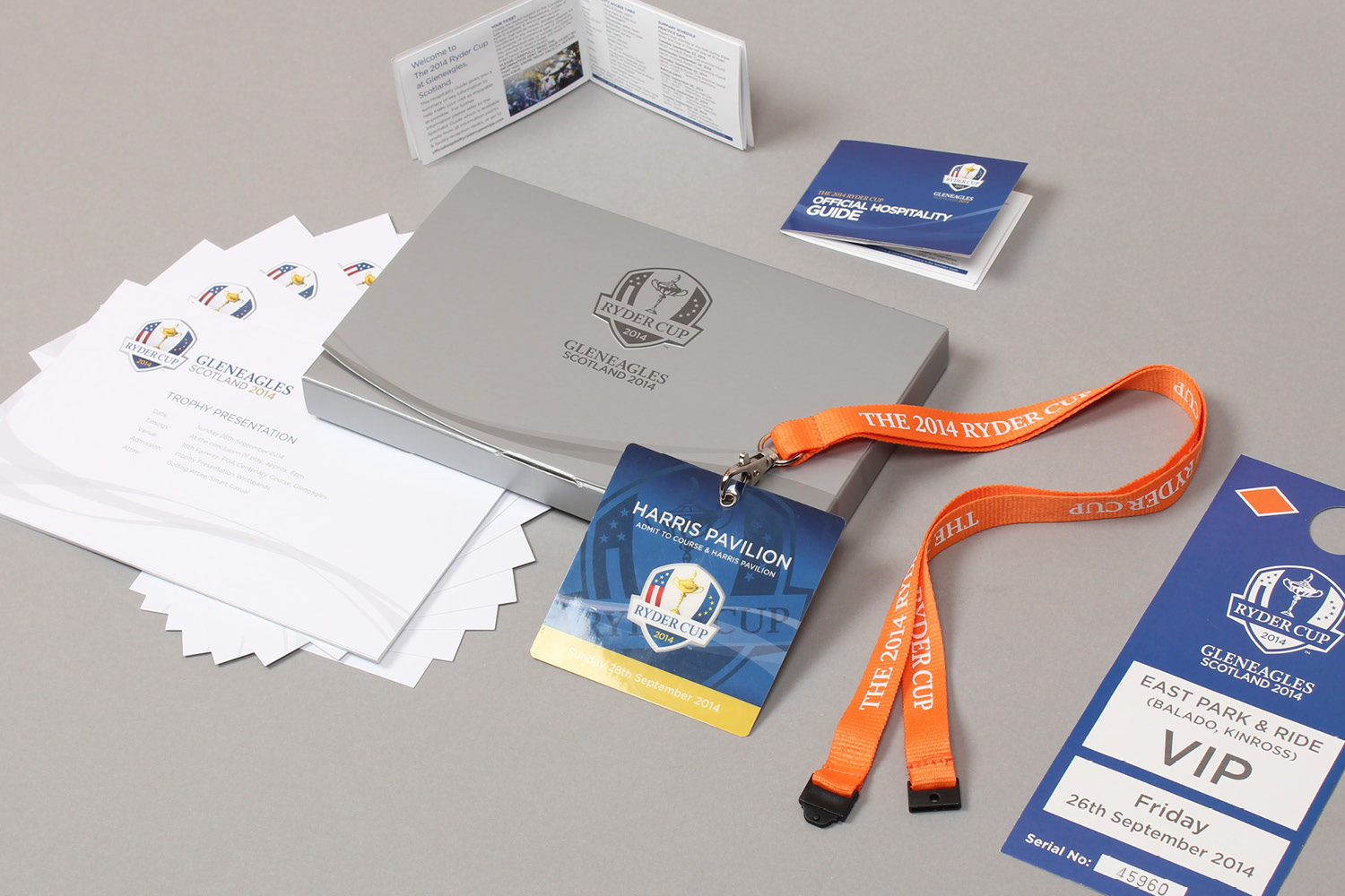
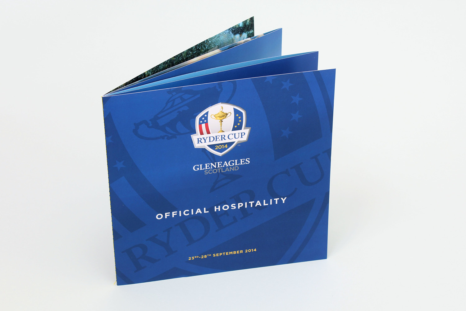
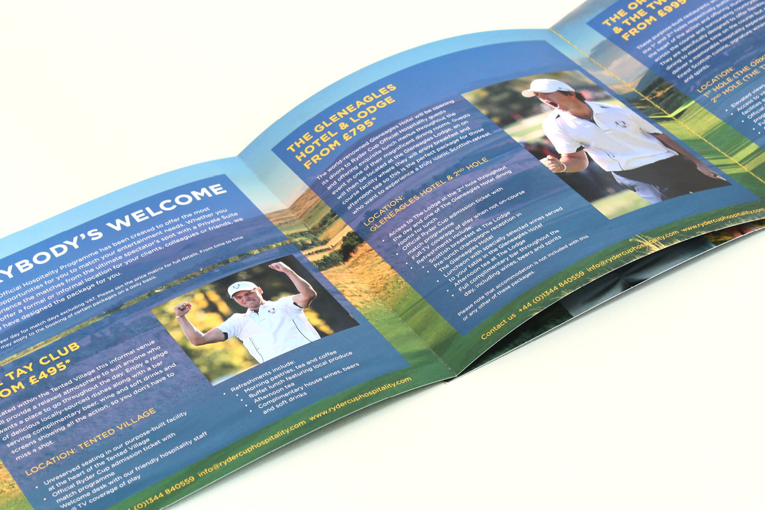
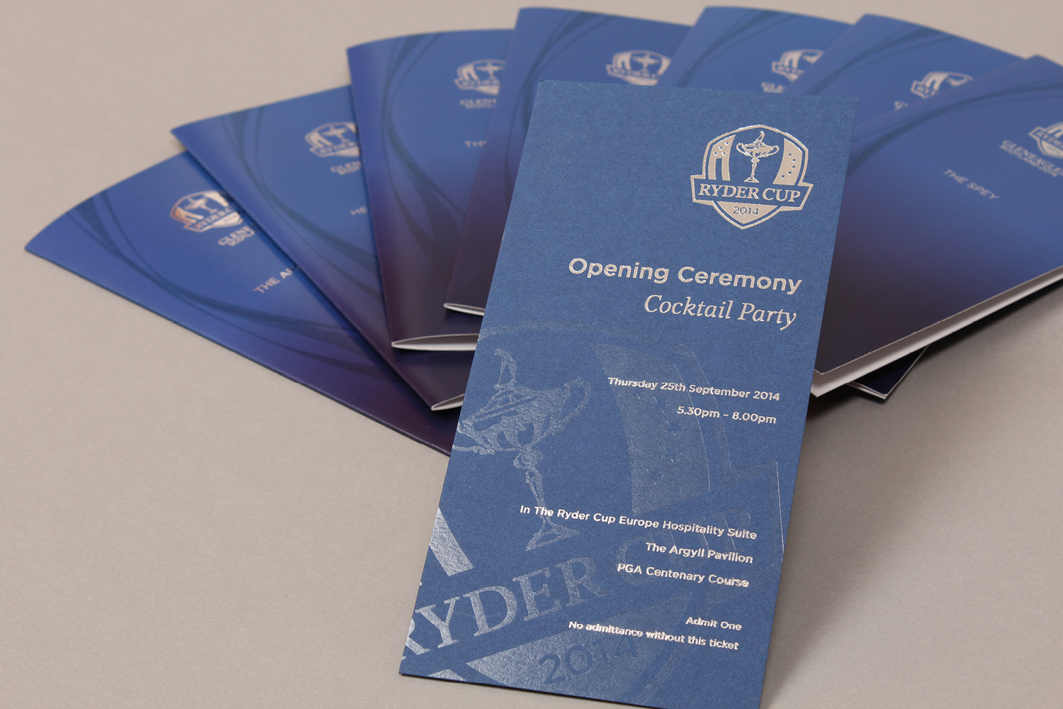
Brand identity, Brand Architecture, Event Styling, Identity Guidelines, Asset Usage Manuals, Merchandise Styling and Guidelines, Hospitality Unit Guidelines, all-encompassing Signage Programme, Digital Promotion, Ticketing, Hospitality, Gala Dinner, Media Press Conferences, Livery
We are proud to have worked closely with Ryder Cup for over 20 years and have created the identity, brand language and styling for 5 home matches and support material for 4 away matches.
From the inception of a Worldwide Trademark in 2012 our task has been to enable consistent on-brand marketing and event branding into the future. We needed to consider every element of the branding process across all creative platforms. The brand language is designed to work from 2014 through to 2016 and 2018 Ryder Cup Matches.
Our task was to solidify the position of The Ryder Cup as the premier golf event and reconfirming it as one of the top international sporting events in the world by consistently visualising the brand attributes to leverage the brand to its full potential, delivering measurable exposure for the Partners and Host Nation.
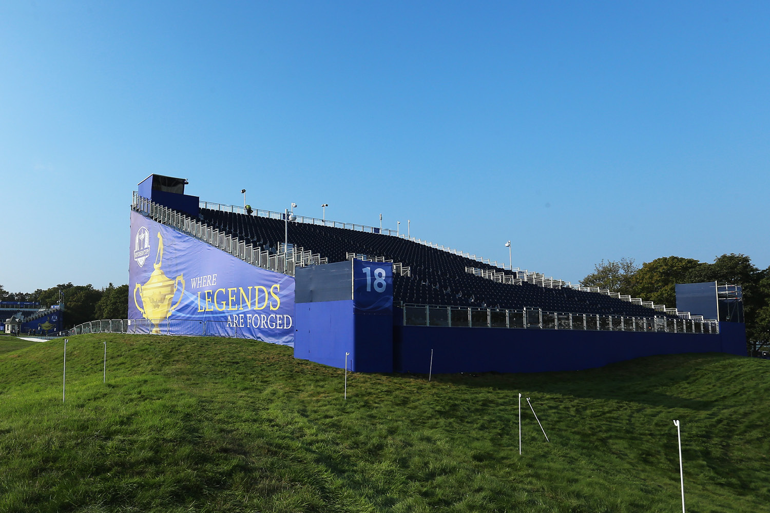
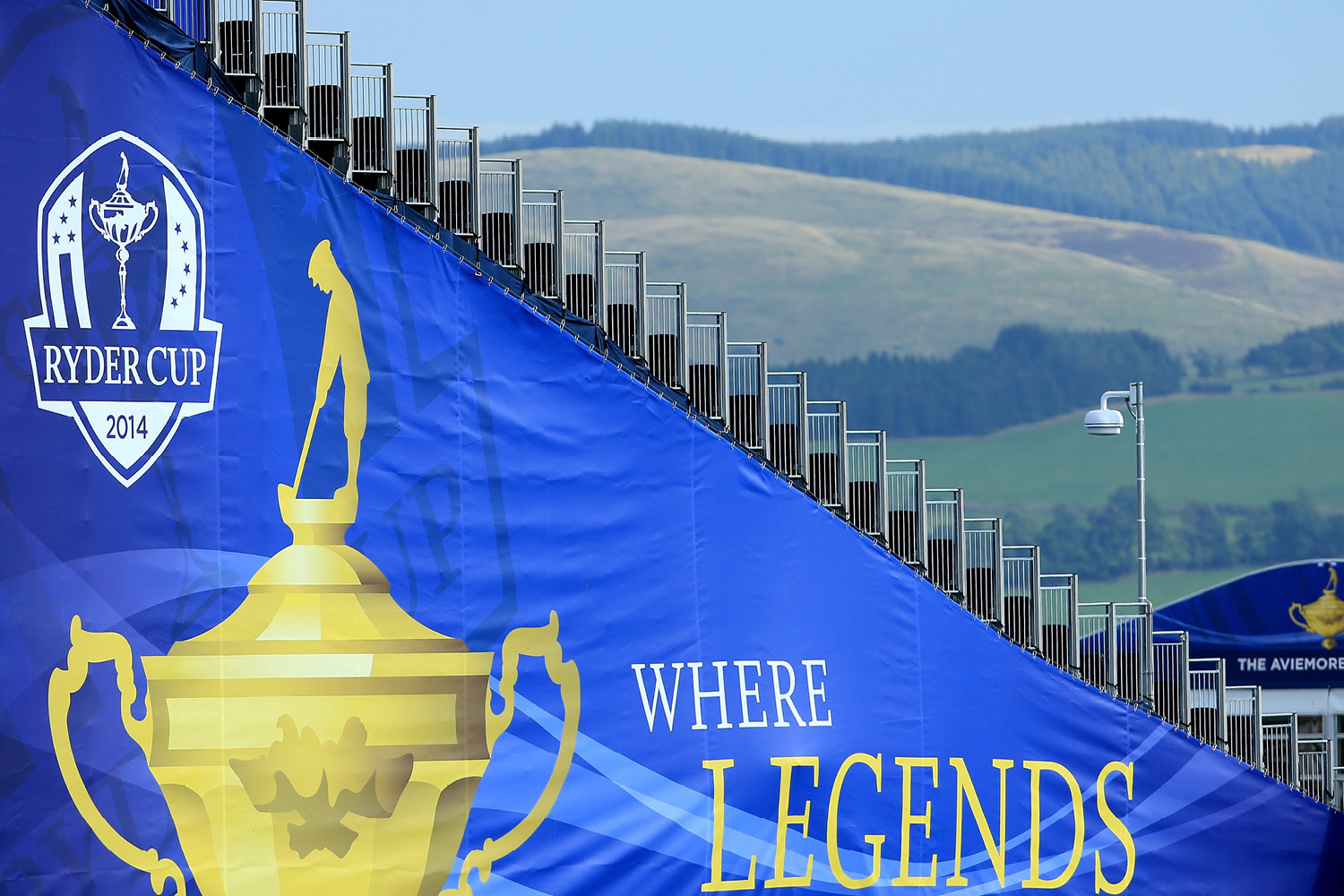
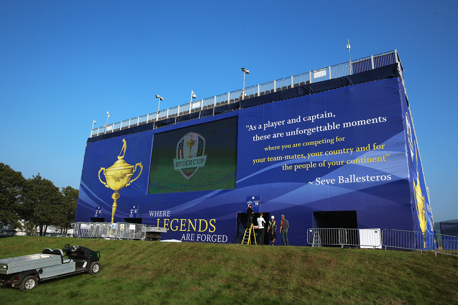
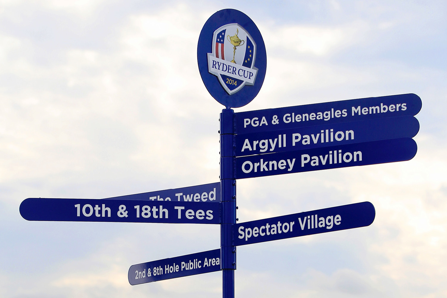
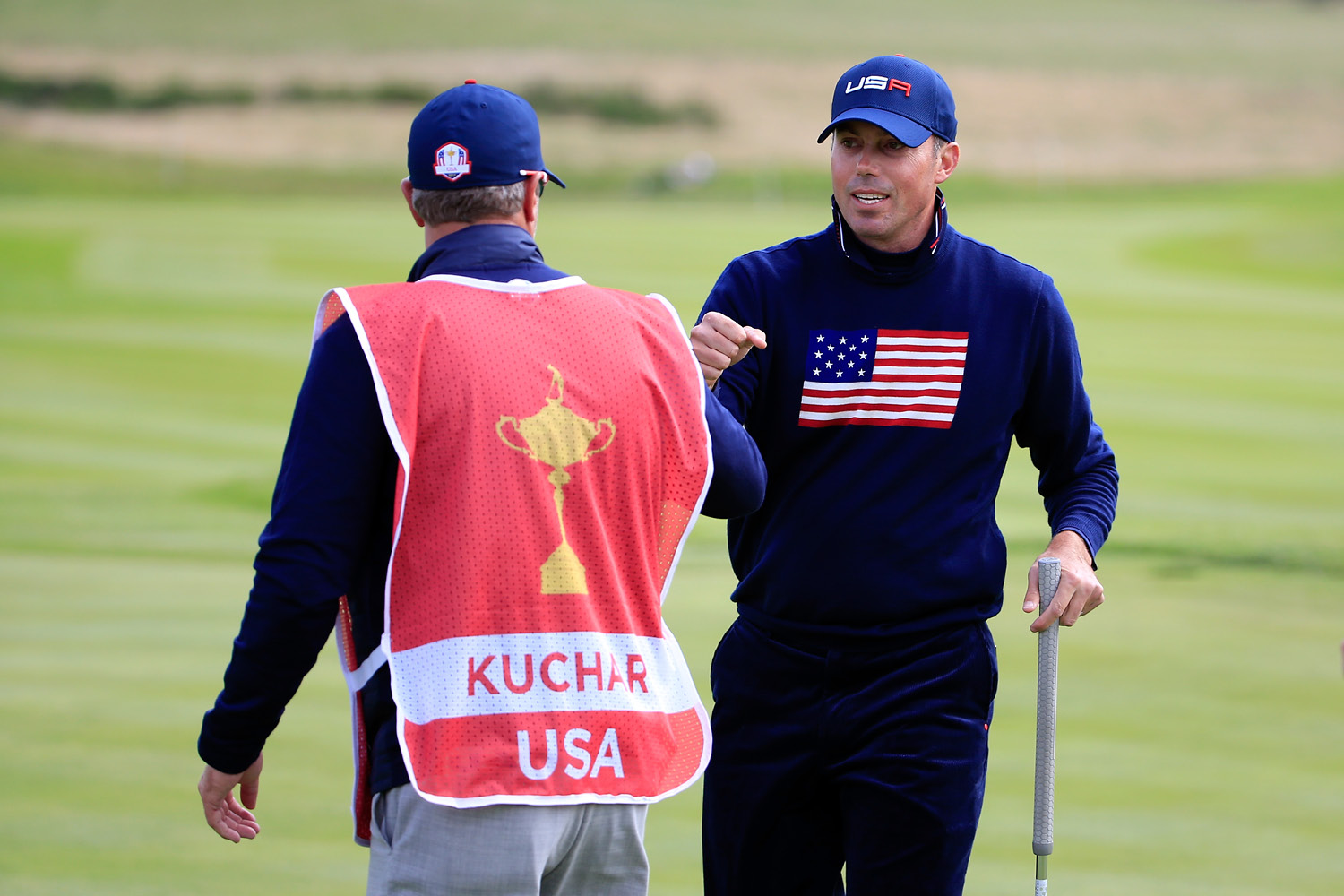
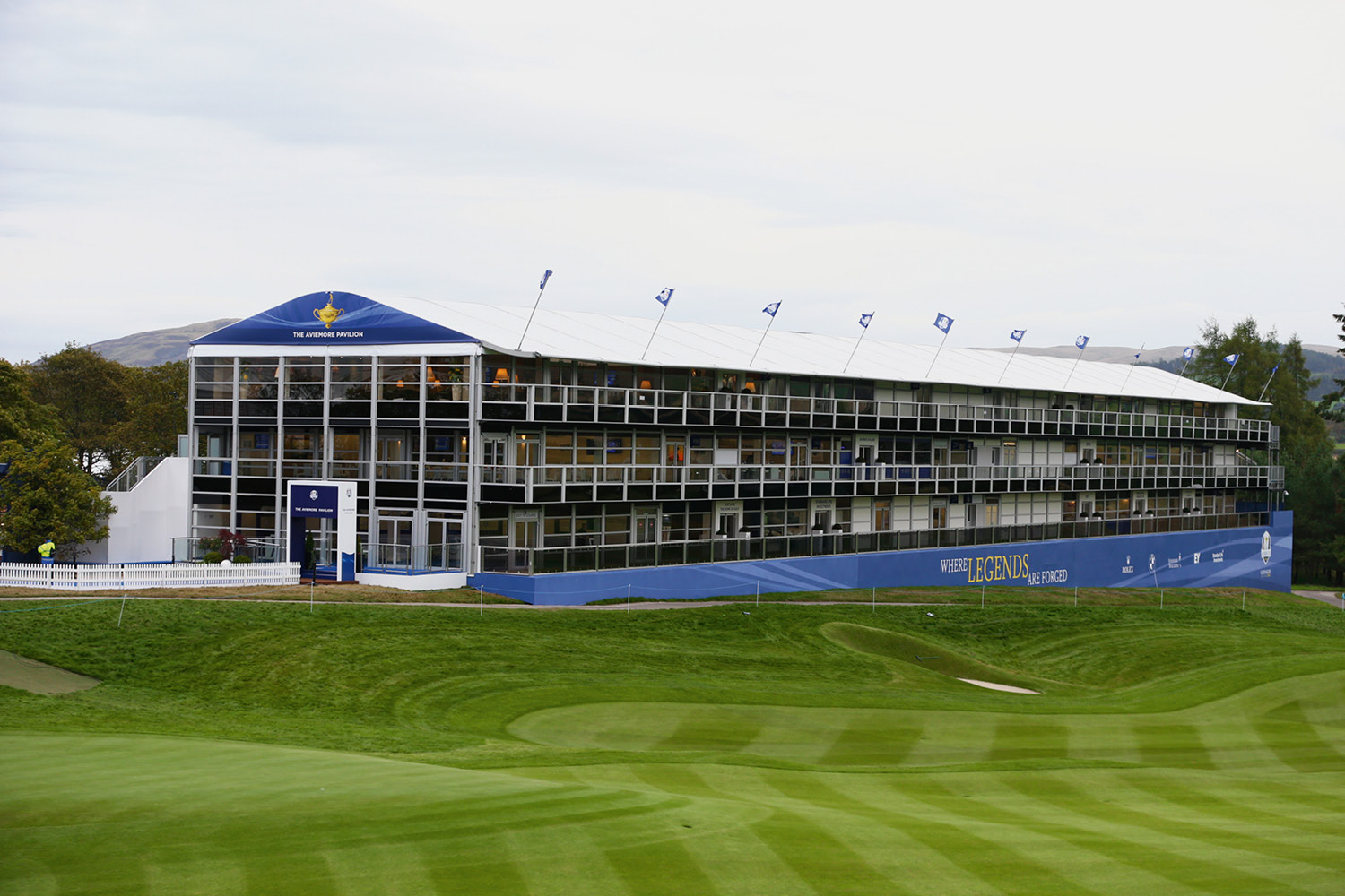
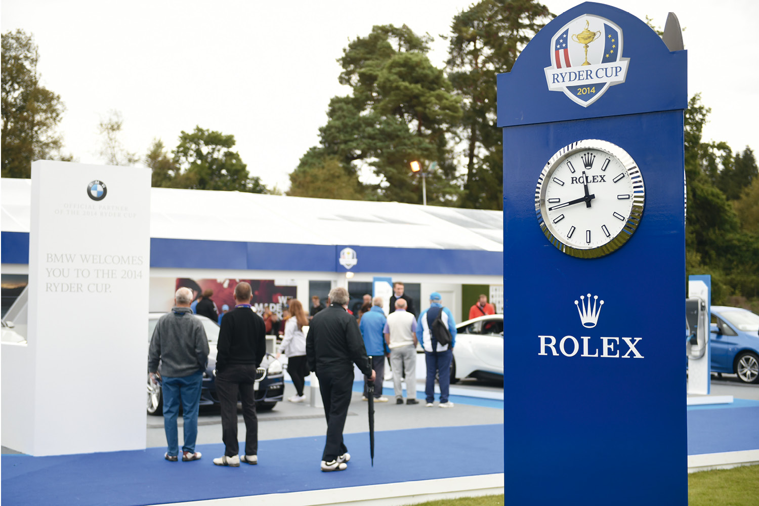
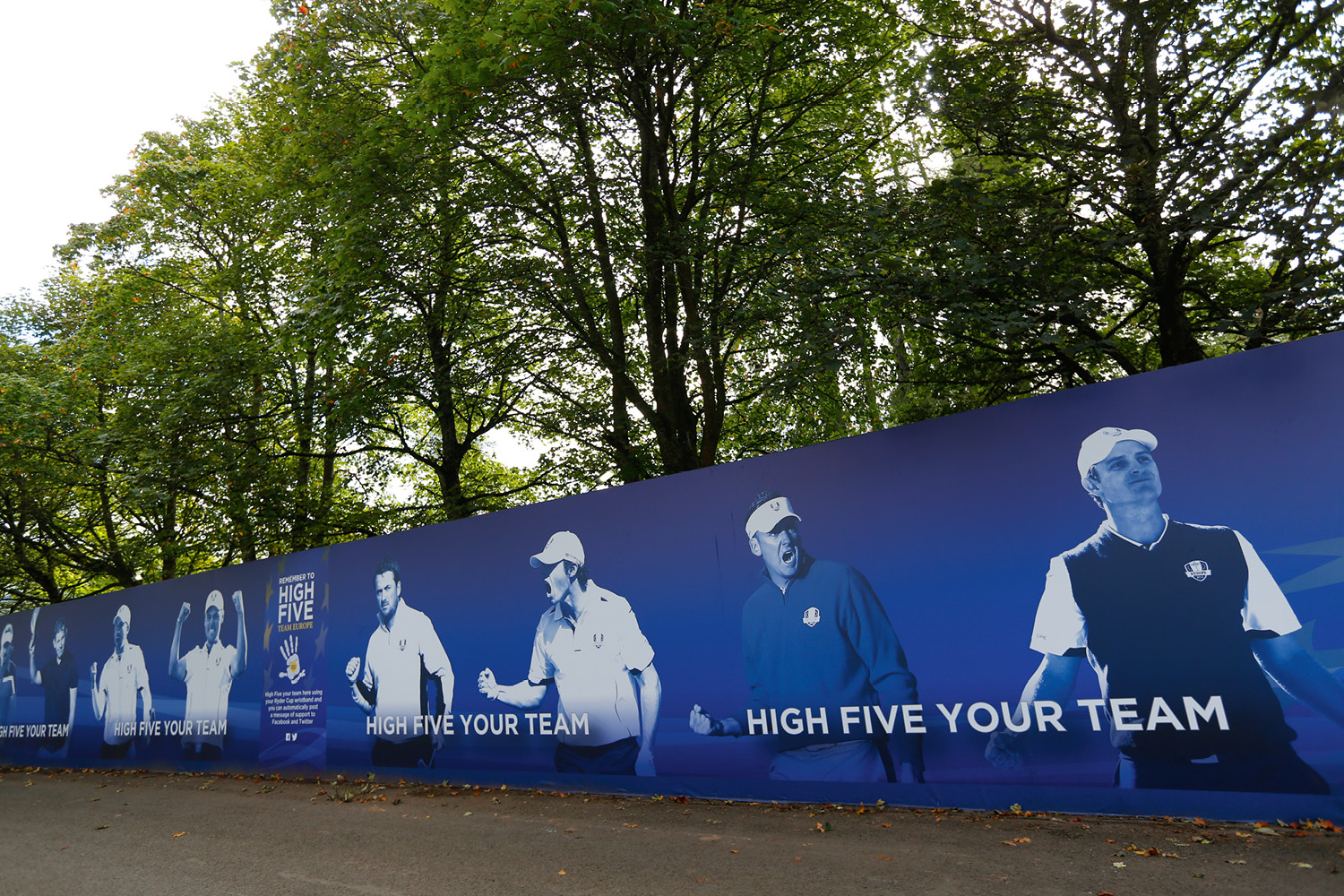
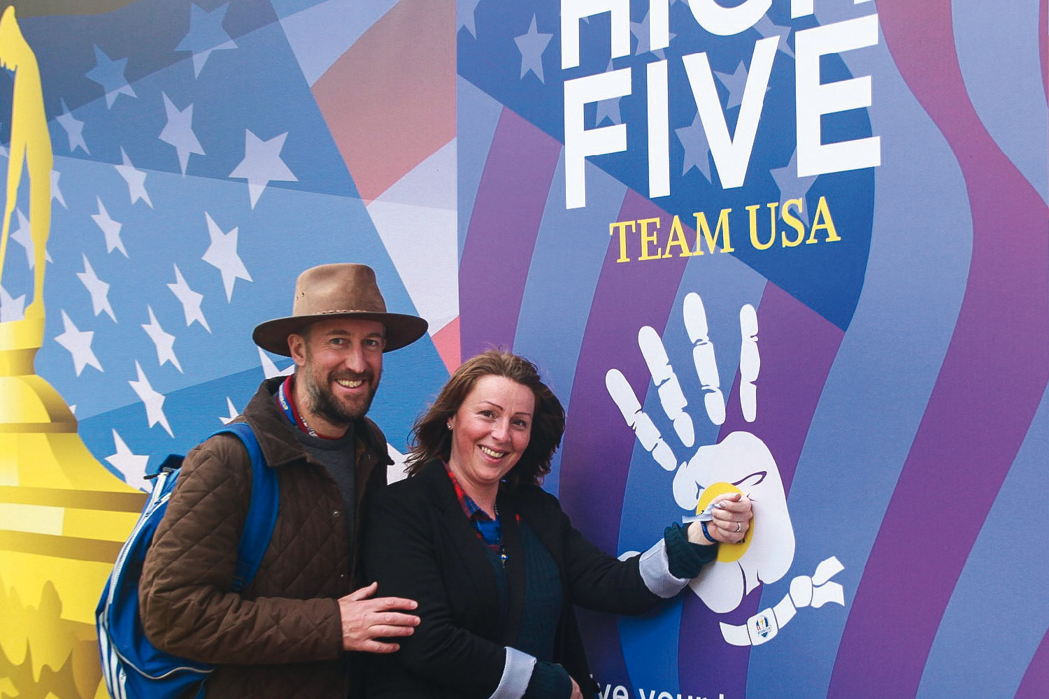
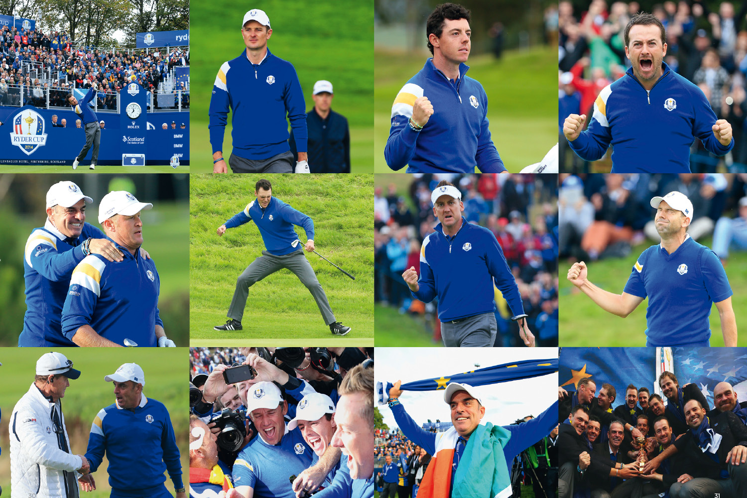
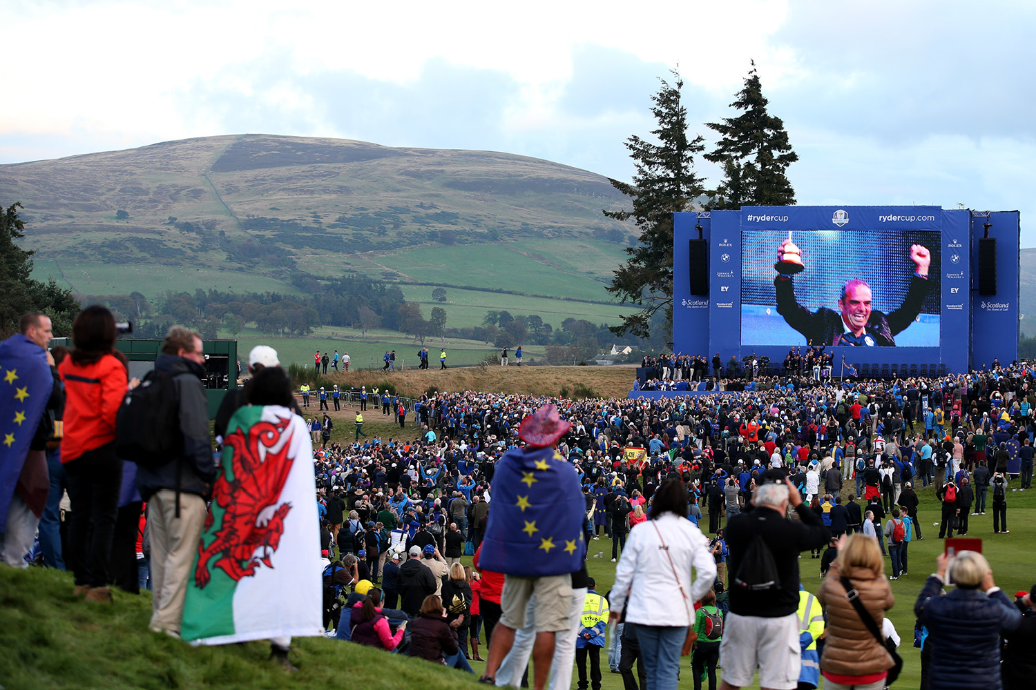
We set the stage with a graphic presentation that enveloped the fans in authentic brand experiences, encouraging the unique outward emotion and interaction between players and fans that drives the intensity and drama created at every Ryder Cup event. Interactive signage, touch points, and photo opportunities allowed fans to engage with social media and build meaningful content.
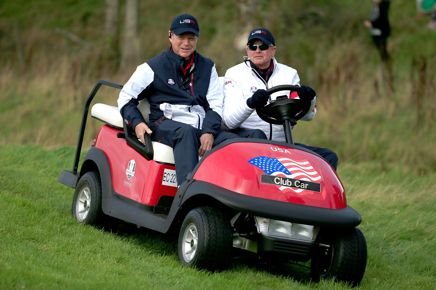
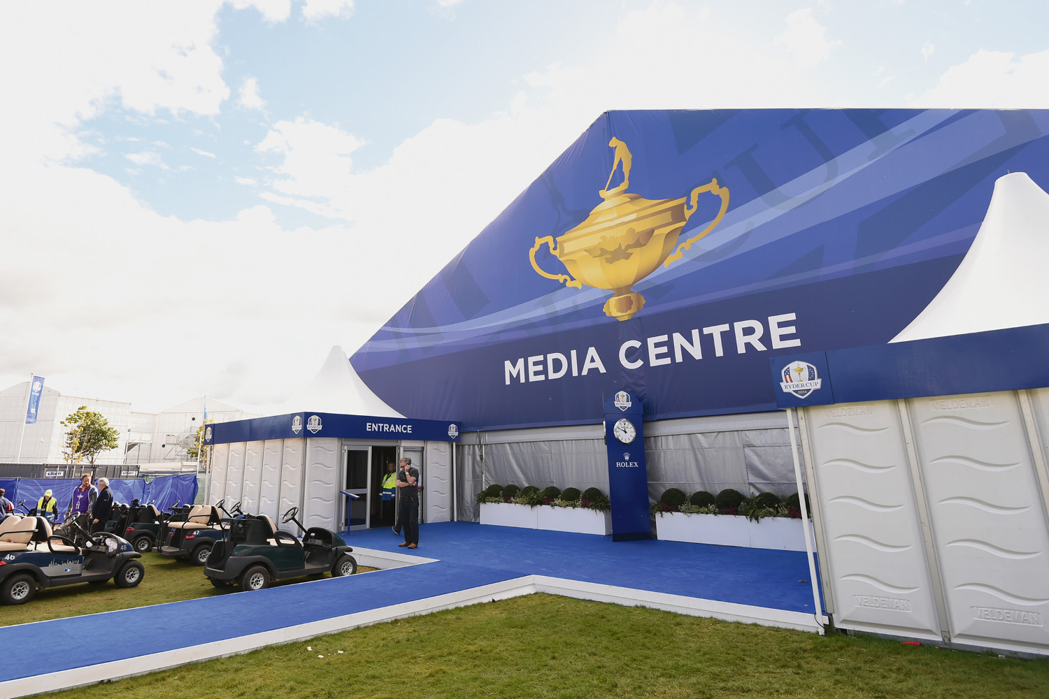
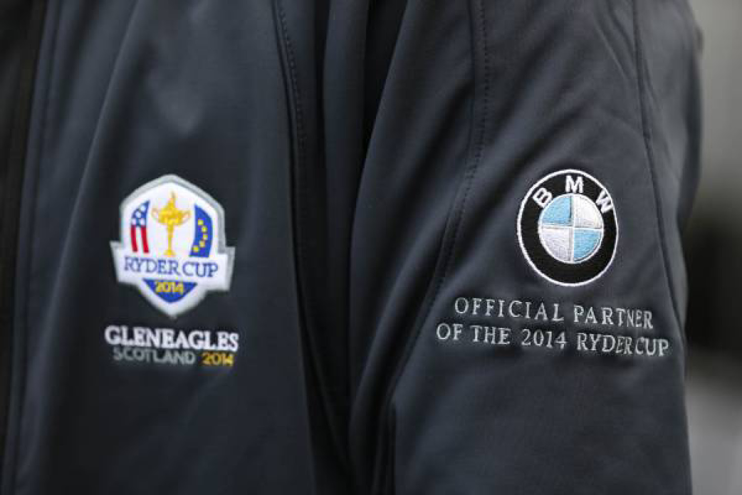
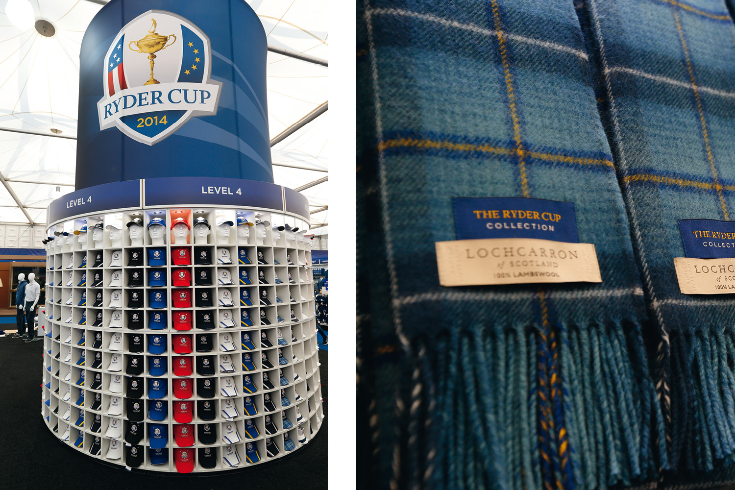
We ensured the entire event, from initial conception to realisation, reflected the brand values. This was achieved by agreeing styling and branding principles, then creating a suite of assets to complement and carry the core brand values. These assets were designed to easily translate across all platforms.